Focus Sans Typography Project
October, 2025
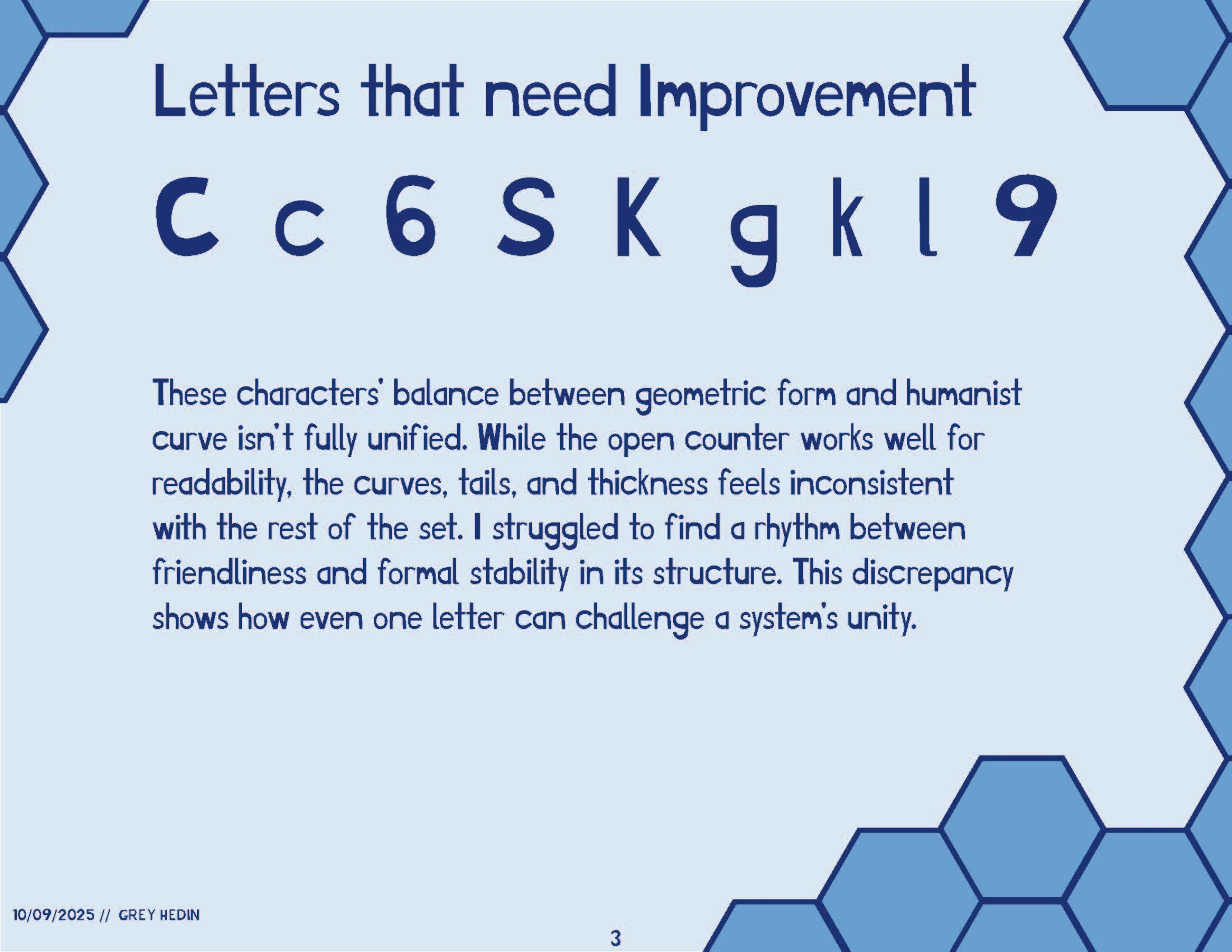
The goal of this project was to create a font that has better legibility for those who have dyslexia. The challenge was to design for dyslexic people, but I am not dyslexic myself. I aimed for the font to be easily readable while staying professional.
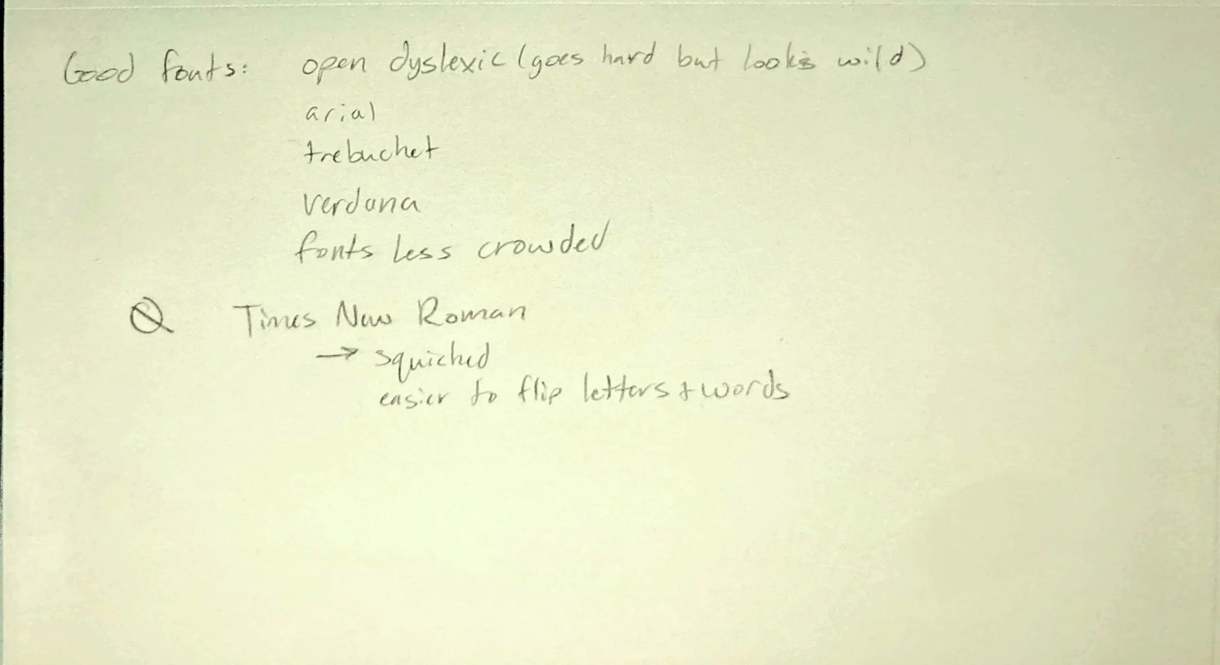
The font is aimed for dyslexic users and those who are visually impaired. Research showed that putting a heavier weight at the bottom of type increases the legibility for those people. The font “Focus Sans” is inspired by “Open Dyslexic” font.
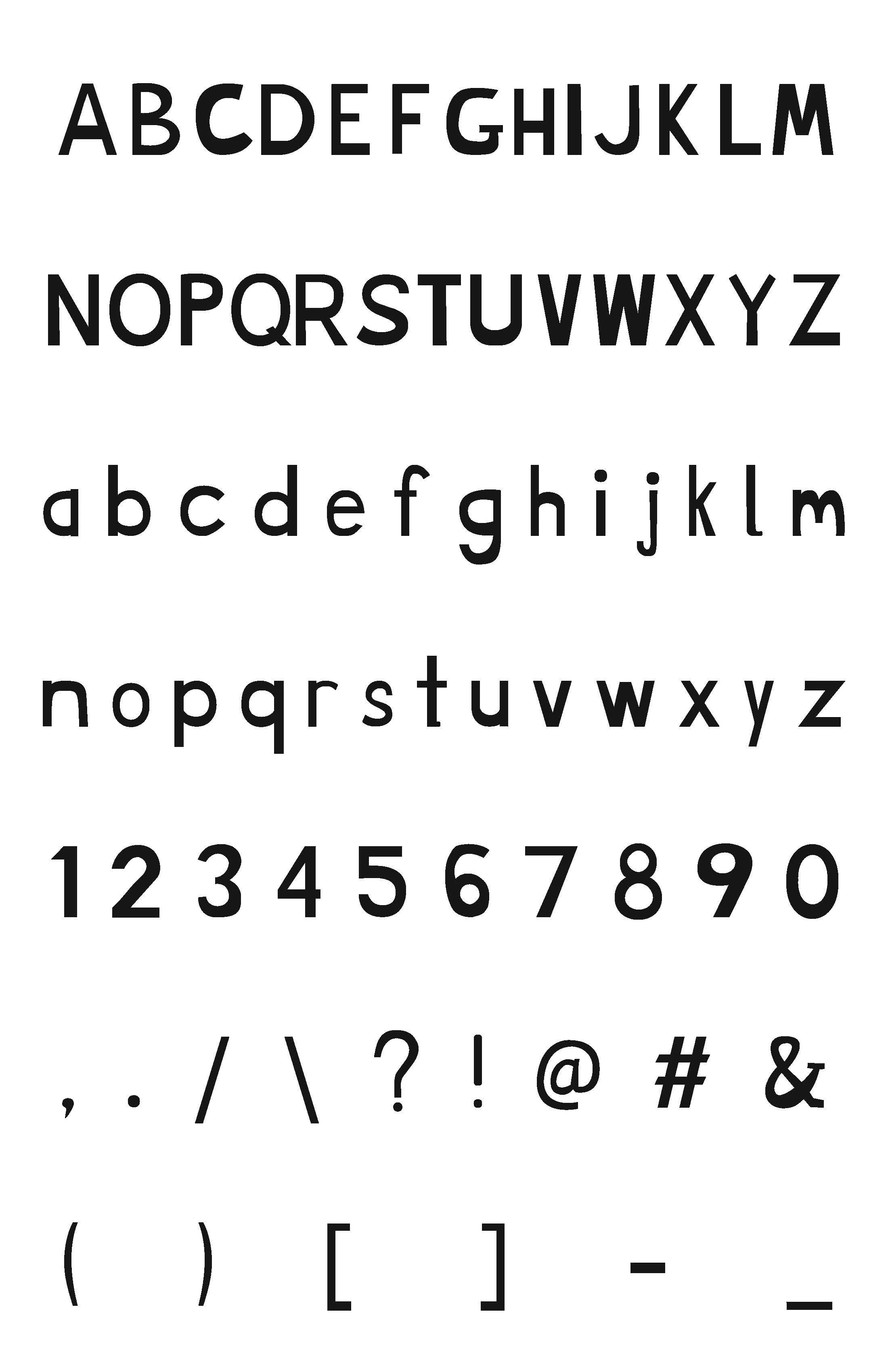
After learning the Glyphs program and its tools, experimenting with the kerning and widths, and building the letters, I created a font with letters A-Z, a-z, 0-9, and some common punctuation.
Slideshow reflecting the process using the font


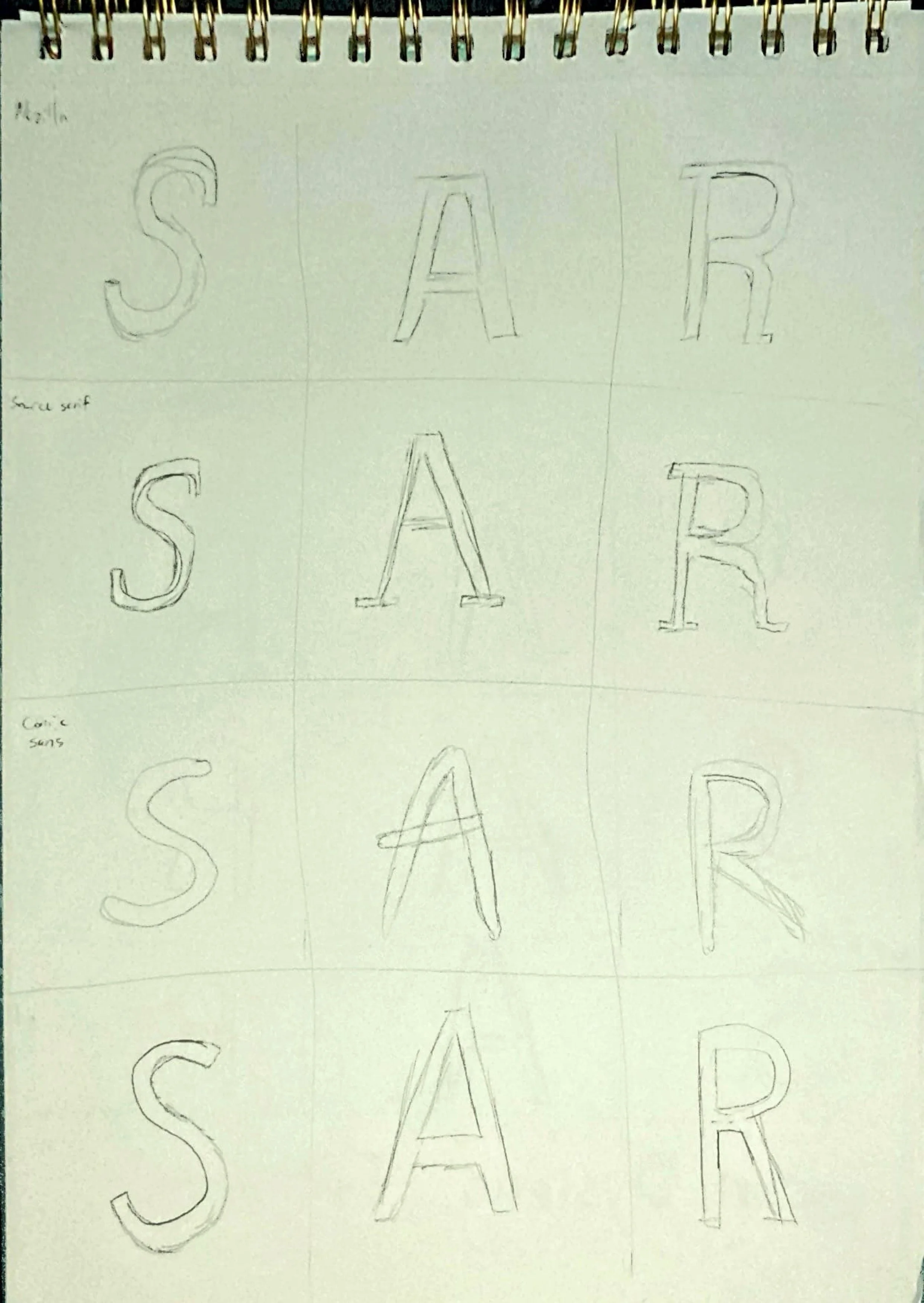
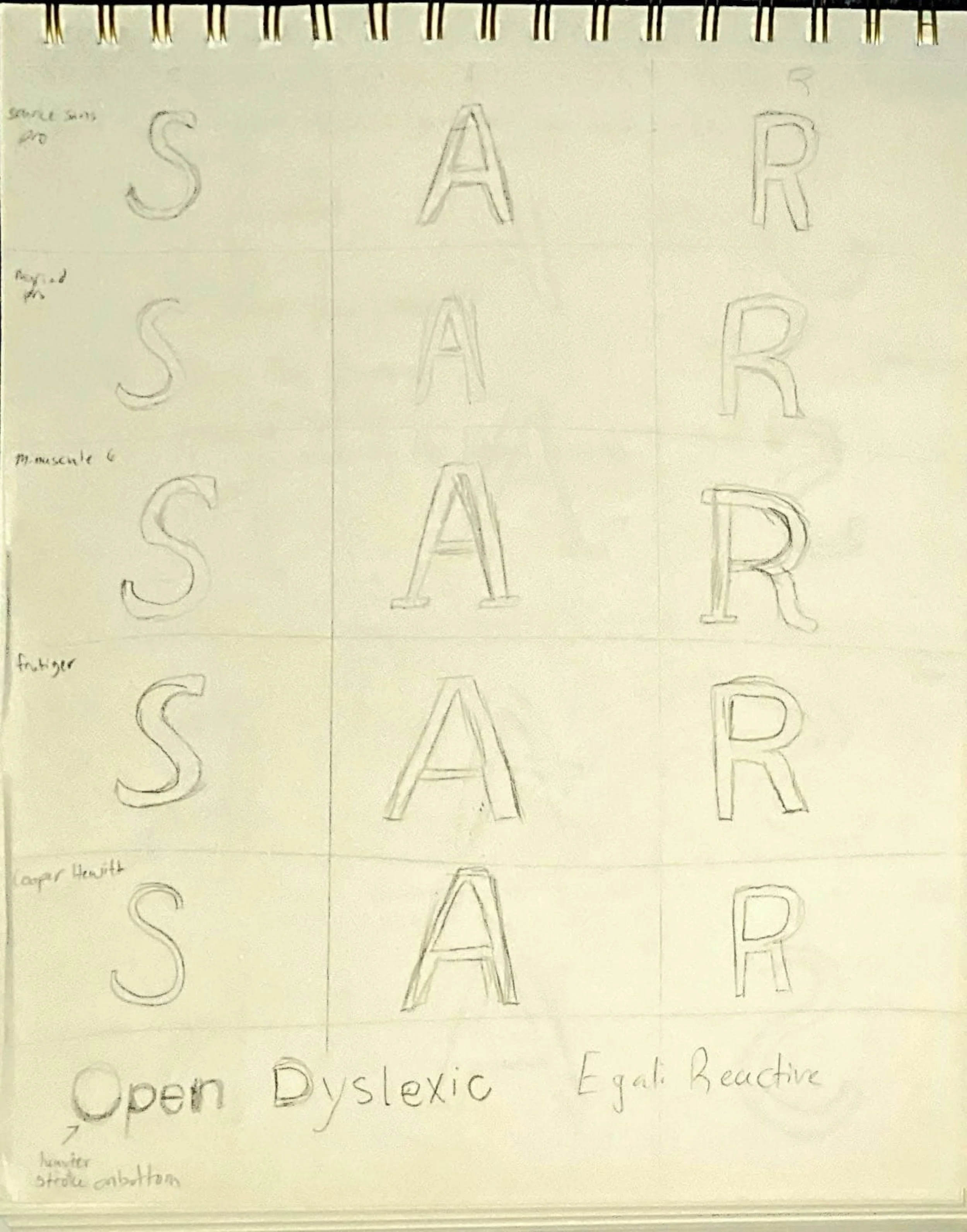
Design Process
Moodboard